Best Link in Bio Tools in 2026: Free and Paid, Compared
 Elitza Vasileva

Want your link in bio to look like a real website? See own.page as a Linktree alternative →
Most advice about the best link in bio is stuck in the old model: add more buttons, pick a nicer theme, call it done.
That's backwards. A bio link page isn't valuable because it holds more links. It's valuable because it gives you one controlled place to turn social attention into a next step. If the page doesn't create clarity, it doesn't matter how many integrations, colors, or templates the tool offers.
The category itself proves how far this format has moved beyond a simple workaround. A 2025 market report says Linktree was used by 24.7 million of 31 million total link-in-bio users, equal to 79.95% market share, and that 62 different companies offer a link-in-bio tool in the market, according to this link-in-bio market report. That's no longer a niche utility. It's a mature software category.
The practical question in 2026 isn't “Which tool lets me list the most links?” It's “Which tool helps me build the best page for the action I want people to take?”
Table of Contents
- Why Your Link in Bio is More Than a List of Links
- How to Choose the Right Link in Bio Tool
- The Top Link in Bio Platforms Compared for 2026
- Deep Dive Reviews of Key Platforms
- Which Link in Bio Tool is Best for Your Use Case
- How to Set Up and Migrate Your Link in Bio Page
- Why own.page is the Best Choice for Your Online Hub
Why Your Link in Bio is More Than a List of Links
The biggest mistake people make is treating a link in bio like a storage drawer. They keep adding destinations and hope visitors sort it out.
That usually hurts results. Stan's guidance points out a major gap in “best link in bio” content: most comparisons focus on feature counts and customization, but skip the more important conversion question of what should appear above the fold and in what order. Their view is clear. The best page is often the one with fewer distractions and a stronger hierarchy, as noted in Stan's platform comparison guide.
A strong page does three jobs at once:
- Sets priority: It tells the visitor what matters first.
- Controls context: It explains the offer, not just the destination.
- Protects brand consistency: It feels like your space, not rented UI.
That's why the best setups behave more like compact landing pages than directories. They use one primary call to action, then support it with secondary paths only if those paths help the same visitor segment.
Practical rule: If every link looks equally important, the page has no strategy.
This is also why richer layouts matter. Text, media, social proof, embedded content, and grouped sections can do what a stack of buttons can't. They give the click context. If you want ideas for what makes a page more useful than a plain link list, this breakdown of must-have widgets for a personal landing page is a helpful reference.
What weak pages get wrong
Many bio pages fail for simple reasons:
- Too many equal-priority links: Visitors have to think too hard.
- No visual hierarchy: The page looks organized to the owner, not the visitor.
- No clear narrative: A person lands there and still doesn't know what to do.
What better pages do instead
The best link in bio pages feel edited. They don't try to show everything. They guide one type of visitor toward one action first, then let everyone else browse.
That shift matters more than any single feature checklist. Once you see your bio page as a conversion surface, not a link stack, your tool choice changes immediately.
How to Choose the Right Link in Bio Tool
The easiest way to choose badly is to compare templates and ignore infrastructure.
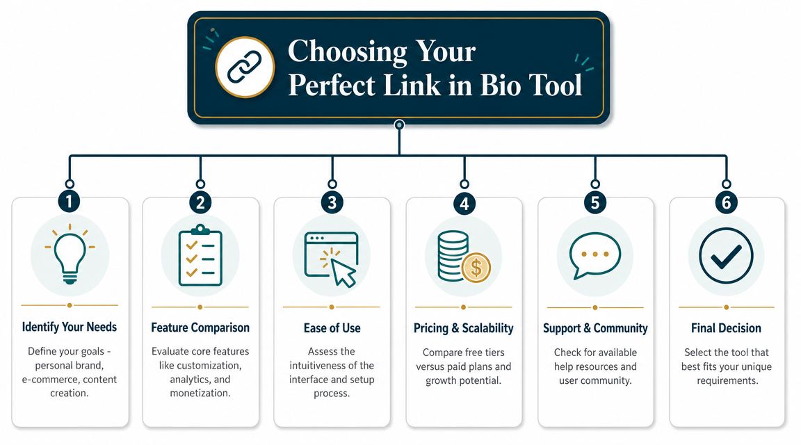
A practical evaluation framework comes from Rebrandly's review, which says the key dimensions are custom domain support, analytics capability, platform reliability, customization depth, and pricing, especially for creators and small businesses that want a branded microsite instead of a generic profile page, according to Rebrandly's link-in-bio tool review.
Start with brand control
Custom domain support holds more significance than commonly realized. If your page lives entirely on someone else's branding, you're borrowing trust instead of building it.
Look for:
- Custom domains: Better if you want a real branded hub.
- Logo and style control: Important if your audience already knows your visual identity.
- Layout flexibility: Useful when you need something beyond stacked buttons.
A freelancer, musician, or local business usually benefits more from a page that feels owned than from one that looks like every other creator page on the platform.
Check whether the page can actually do anything
A lot of tools still assume your job is to send people elsewhere. That's fine if all you need is a simple traffic router. It's weak if you want your page itself to carry meaning.
What I look for here:
| Need | Why it matters |
|---|---|
| Rich embeds | Lets visitors preview content without extra clicks |
| Flexible sections | Helps group offers by intent |
| Mobile-first editing | Useful when updates happen fast |
| Media support | Better for portfolios, launches, and creator pages |
Analytics and reliability decide long-term value
A polished page without usable insight becomes guesswork. You need enough analytics to understand what visitors choose, what gets ignored, and what deserves top placement.
Reliability is just as important. If your bio page breaks during a campaign, your social profile breaks with it.
The best tool isn't the one with the most features. It's the one that supports your brand, tracks behavior clearly, and doesn't become a constraint when your audience grows.
Pricing should match your growth path
Cheap tools can get expensive in hidden ways. Not in direct cost alone, but in the friction they create when you outgrow them.
Ask three practical questions:
- Can you start simple without rebuilding later?
- Do paid features deliver real business value, or just cosmetic upgrades?
- Will you need extra tools for analytics, branding, or embeds right away?
If the answer to the third question is yes, the cheaper plan may not be cheaper.
The Top Link in Bio Platforms Compared for 2026
Shopping for the best link in bio tool often presents a choice between two models. The first is the classic link list. The second is the page builder that happens to live in your bio.
That distinction matters more than the logo on the pricing page.
Here's the quick comparison I'd use if I were narrowing down the field today.
Link in Bio Platform Comparison Matrix 2026
| Tool | Best For | Customization | Rich Embeds | Analytics | Pricing Model |
|---|---|---|---|---|---|
| own.page | Creators, freelancers, and small brands that want a branded mini-site | High | Strong | Built-in, visual | Free tier plus paid upgrade |
| Linktree | Fast setup and simple outbound link management | Low to medium | Limited to moderate | Basic to moderate | Free tier plus paid upgrade |
| Beacons | Creator pages with monetization-oriented blocks and more visual layout control | Medium to high | Moderate | Built-in | Free tier plus paid upgrade |
| Carrd | Users who want flexible one-page design and don't mind more setup | High | Good | Depends on setup | Paid plans with builder-style pricing |
| Lnk.bio | Minimalist users who want a quick, basic link page | Low | Limited | Basic | Free tier plus paid upgrade |
This table doesn't tell the whole story, but it shows where the trade-offs start.
What stands out fast
Linktree is still the baseline. It's familiar, quick to launch, and easy to manage. If your only job is listing destinations, it still works.
Beacons pushes further into creator workflows. It gives you more visual structure and a broader set of blocks, which makes it more useful for people who want a page with more personality.
Carrd isn't a traditional link-in-bio tool, but it's often a smart choice for people who want more design freedom than dedicated tools allow. The trade-off is that it feels more like building a lightweight site than filling out a profile page.
Lnk.bio does the bare minimum well. That's either an advantage or a limitation, depending on your goals.
For readers who want a broader creator-focused roundup, this list of link-in-bio tools for creators is useful alongside the comparison above.
The practical split
If you only need to organize links, the simple tools are enough.
If you want your bio page to function like a branded landing page with content, structure, and stronger conversion intent, then a page builder style tool will usually fit better. That's where the category is moving, and it's why “best link in bio” now means more than “best list of buttons.”
Deep Dive Reviews of Key Platforms
Three tools define the main approaches in this category: Linktree as the default directory, Beacons as the creator utility layer, and own.page as the page-builder approach.
Each one can work. The right pick depends on whether you need a list, a creator hub, or a more flexible branded page.
Linktree
Linktree became the category standard for a reason. It removes friction at setup, keeps the interface simple, and does exactly what users expect when they hear “link in bio.”
That simplicity is also the ceiling.
Linktree works best when your goal is straightforward traffic distribution:
- Send people to a few external destinations
- Set up quickly
- Avoid design decisions
- Use a familiar pattern your audience already recognizes
Where it starts to feel limiting is structure. If you want hierarchy, richer storytelling, or a page that feels more like your own branded environment, the default Linktree experience starts to show its constraints.
Beacons
Beacons sits in the middle. It's broader than a simple link hub and more creator-oriented in how it thinks about page sections, content blocks, and monetization-adjacent features.
That makes it useful for creators who need more than buttons but don't want to move into full site-building mode.
Beacons tends to fit people who want:
- A more visual layout
- Multiple content blocks
- A creator-centric page feel
- More flexibility than entry-level tools
The trade-off is focus. A page can become crowded if you keep adding elements without a clear hierarchy. Beacons gives you more freedom than Linktree, but freedom doesn't automatically create clarity.
A flexible page builder helps only if the owner makes hard decisions about priority.
own.page
The strongest case for a page-builder approach is when a bio page needs to do more than route traffic. That's where own.page stands out as a tool category, not as another button-list variant.
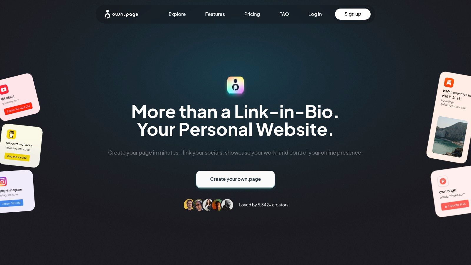
It's built more like a lightweight personal site builder. You can assemble pages with drag-and-drop blocks for links, text, images, video, and embedded content from platforms like YouTube, Spotify, TikTok, Instagram, GitHub, and calendars. That makes it more suitable for portfolios, creator hubs, and service pages where context matters before the click.
The practical strengths are clear:
- More layout freedom than a classic link list
- Better support for media-rich pages
- A closer fit for branded microsites
- Useful when one page needs to function as homepage, portfolio, and bio link
The trade-off is equally clear. If all you need is a fast list of outbound links, this kind of tool can be more than necessary. But if your current bio page feels cramped, generic, or too shallow to represent what you do, the extra flexibility starts to matter fast.
Which philosophy fits you
Here's the simplest way I'd frame it:
| Platform | Core philosophy | Best match |
|---|---|---|
| Linktree | Organize links fast | Beginners and simple routing |
| Beacons | Add creator-focused blocks | Content creators with broader needs |
| own.page | Build a branded mini-site | Freelancers, creators, and small brands needing context and design control |
A lot of frustration with link-in-bio tools comes from choosing the wrong philosophy, not the wrong product. If you want a page, don't buy a list.
Which Link in Bio Tool is Best for Your Use Case
The best link in bio depends less on industry labels and more on what action you want after the click.
Buffer notes that link-in-bio tools are mainly for collating multiple URLs into one mobile-friendly destination, while Stan's guidance emphasizes a more disciplined structure: on Instagram, lead with one primary action at the top, and on TikTok, send traffic to one clear outcome with minimal friction, as covered in Buffer's guide to link in bio.
That means use case should drive both the tool choice and the page structure.
Creators and influencers
Creators usually don't need more links. They need better prioritization.
If you're publishing across Instagram, TikTok, YouTube, or newsletters, your page should answer one question fast: what's the main action right now?
Best fit:
- Beacons if you want creator-focused blocks and a broader feature set
- Linktree if you want speed and simplicity
- A richer page builder if your offers rotate often and need more explanation
For creators, the mistake is making every offer visible at once. Your lead magnet, latest video, paid offer, and affiliate stack shouldn't all compete equally.
Freelancers and independent professionals
Freelancers need a page that builds trust quickly. A generic button list often undersells serious work.
You usually need:
- A strong intro
- Selected work or proof
- One booking or contact action
- A clean branded layout
Carrd works well if you like more design control. Page-builder style tools work well if you want a lighter setup with richer blocks and embeds. Simple list tools can still work, but only if your service offer is already obvious from your profile and audience context.
For service businesses, the top of the page should usually answer who you help, what you do, and what to click next.
Musicians and artists
This group benefits most from media support. A plain list of streaming links often wastes the chance to show the work.
Useful elements include:
- Embedded music or video
- Tour dates or event details
- Merch or commission links
- Press kit or portfolio access
Tools with richer embeds and stronger visual presentation usually make more sense here than minimalist link lists.
Small businesses
Small businesses often use a bio page as a campaign hub. That means clarity matters more than customization for its own sake.
A local café, salon, consultant, or studio usually needs one of these paths at the top:
- Book now
- Browse current offer
- Contact us
- Visit store or menu
If the page starts with five equal options, customers hesitate. If it starts with the most likely action, the page works.
A simple rule for matching tool to use case
Use a simple link tool if your audience already knows what they want and just needs directions.
Use a page builder style tool if the visitor needs context, proof, media, or a stronger reason to act.
That's the dividing line that matters.
How to Set Up and Migrate Your Link in Bio Page
Switching platforms is usually easier than people expect. The core work isn't technical. It's editorial.
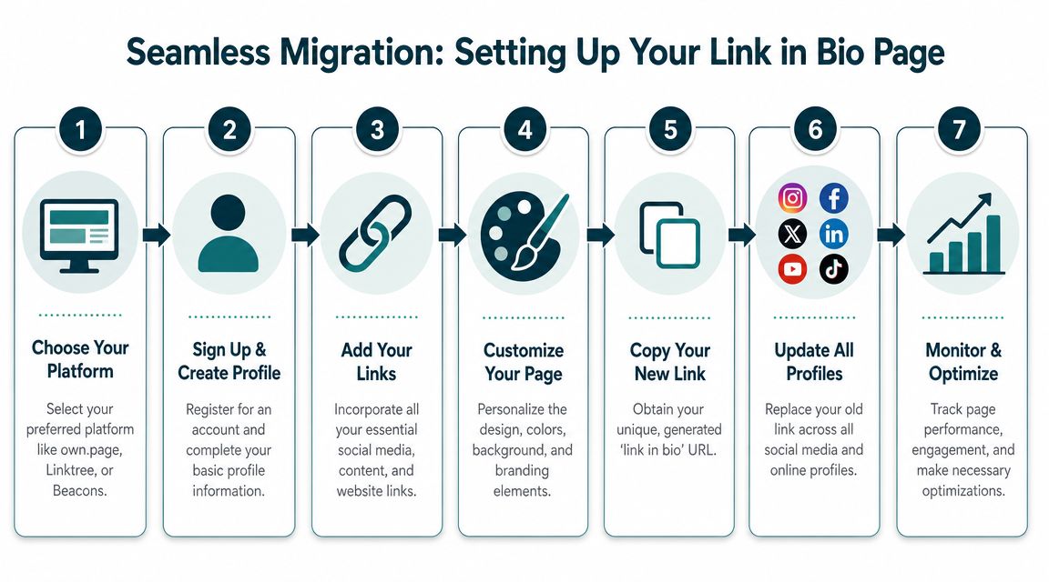
Start by auditing what's on your current page. Many find they don't need half their links anymore. Old campaigns, duplicate destinations, and low-value clicks create clutter.
A clean migration workflow
Audit current links
Remove anything outdated, repetitive, or off-message.Choose the new structure first
Don't import chaos into a new platform. Decide what should appear first, what belongs lower, and what can disappear.Rebuild with intent
Add branding, tighten copy, and make the primary action obvious.
If your page relies on visual content, pulling in live embeds can improve the result. For example, this guide on how to embed an Instagram feed shows one way to make a bio page feel more active and current.
A short walkthrough helps if you're setting one up from scratch:
What to do after launch
Once the page is live:
- Update every profile: Instagram, TikTok, YouTube, X, LinkedIn, email signature, and anywhere else the old URL appears.
- Check mobile presentation: Most visitors will see it on their phone first.
- Watch behavior early: The first round of clicks usually tells you what deserves to move higher or lower.
If you're migrating from a discontinued product like Bento, the safest move is to rebuild around a clearer page hierarchy instead of trying to replicate the old structure exactly.
Why own.page is the Best Choice for Your Online Hub
The strongest argument for own.page is simple: it fits the modern job of a bio page better than a basic link list does.
Later describes link in bio as a mini web page built into social profiles and explains that the format exists because major platforms restrict outbound linking to a single profile link. It also frames high-performing pages as customizable, conversion-focused destinations rather than plain directories, as explained in Later's link-in-bio overview.
That's the right lens for choosing a tool.
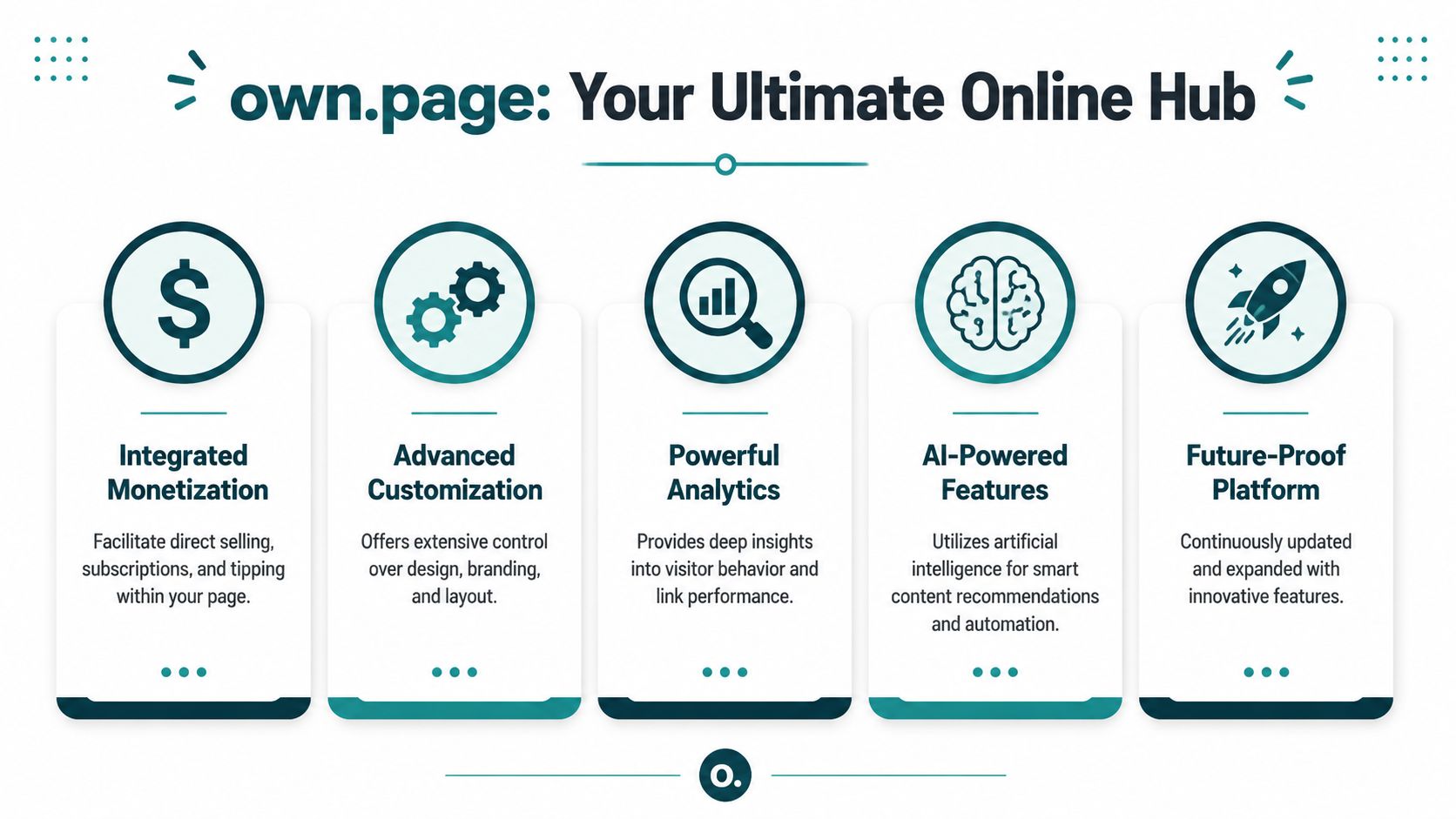
If your bio page needs to act like a real online hub, you need more than stacked buttons. You need space for branding, content blocks, rich embeds, and a layout that supports one clear path while still showing the depth of what you do. That's where own.page makes sense. It gives creators, freelancers, and small businesses a way to build a mobile-first page that can function as a homepage, portfolio, or link in bio without requiring a full custom website.
Why this matters in practice
A good online hub should help you do these things well:
- Show what you do fast
- Support rich content, not just links
- Keep branding consistent
- Let you adjust the page as campaigns and offers change
That's why I'd separate own.page from classic link aggregators. It's closer to a lightweight page builder for bio traffic than a button manager.
Your social profile gives you one link. The right tool turns that limit into a controlled destination you actually own.
For anyone who's outgrown the old “list every platform and hope” approach, that's the upgrade that matters.
If you want a link in bio that feels like a real branded page instead of a generic link stack, try own.page. It's a practical fit for creators, freelancers, and small businesses that want one mobile-first hub for links, media, portfolio content, and updates without building a full website from scratch.
Created with Outrank app
Free tools · no sign-up